
Promokit Theme Settings (pkthemesettings)
Overview
The Theme Settings module lets you control the main appearance and behavior of the Alysum theme, including layouts, typography, presets, all from a single panel.
General Tabs
Welcome
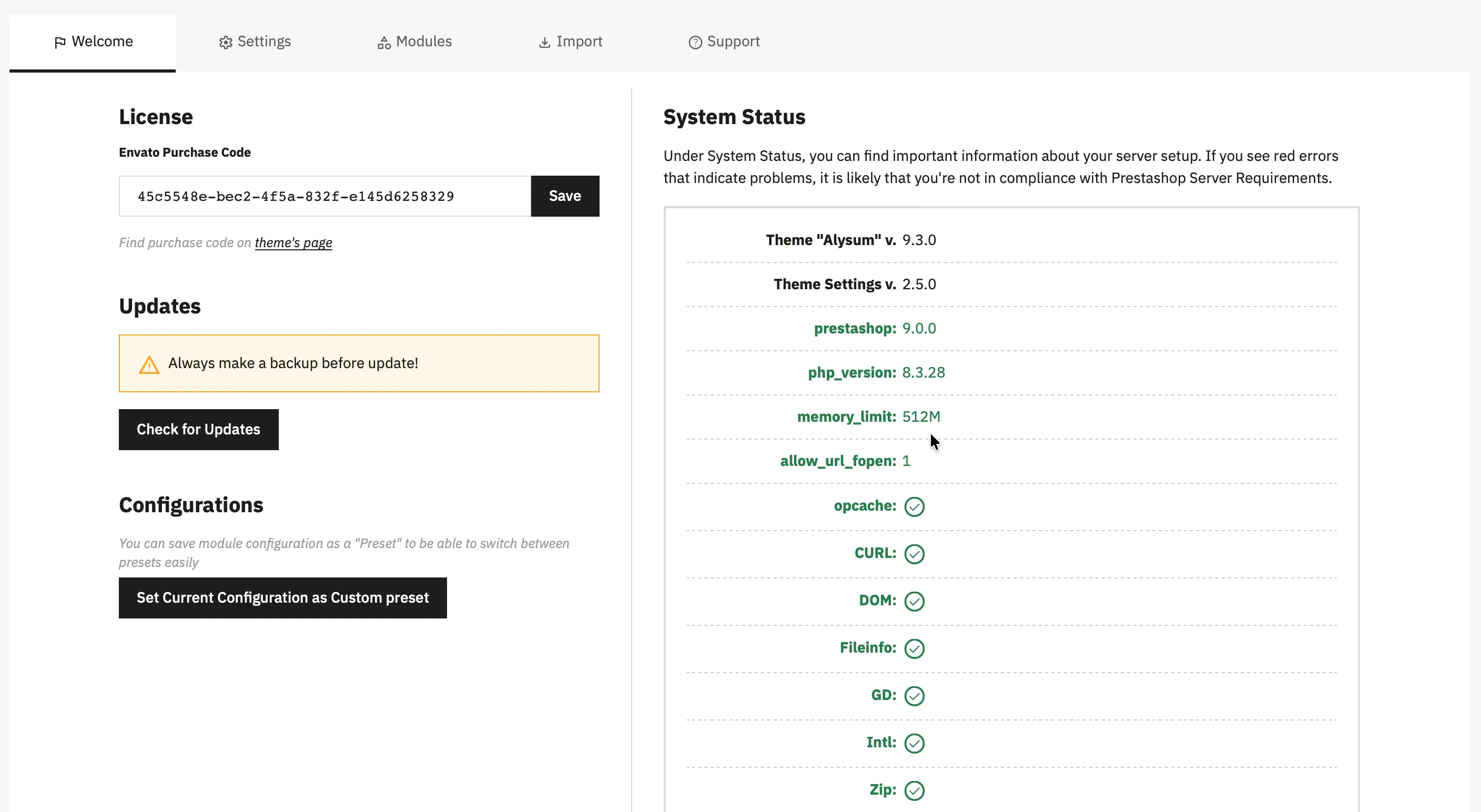
The Welcome tab provides an overview of your Alysum theme installation and system environment. It helps you verify licensing, manage updates, save configurations, and quickly check server compatibility with PrestaShop requirements.
License
Enter and save your Envato Purchase Code to activate the theme and enable updates and support. Find purchase code on theme's page
Updates
Check for available theme updates directly from the panel. If an update is available, you will see detailed information along with an Update button. See this video tutorial for more details.
Configurations
Save the current theme and module configuration as a custom preset, allowing you to make a backup of your current configuration.
System Status
Displays detailed information about your store environment, including:
- Installed versions of Alysum theme, Theme Settings, and PrestaShop
- PHP version and memory limit
- Required PHP extensions and server settings (OPcache, cURL, DOM, GD, Intl, Zip, etc.)
Green indicators confirm that your server meets PrestaShop and Alysum requirements.
Modules
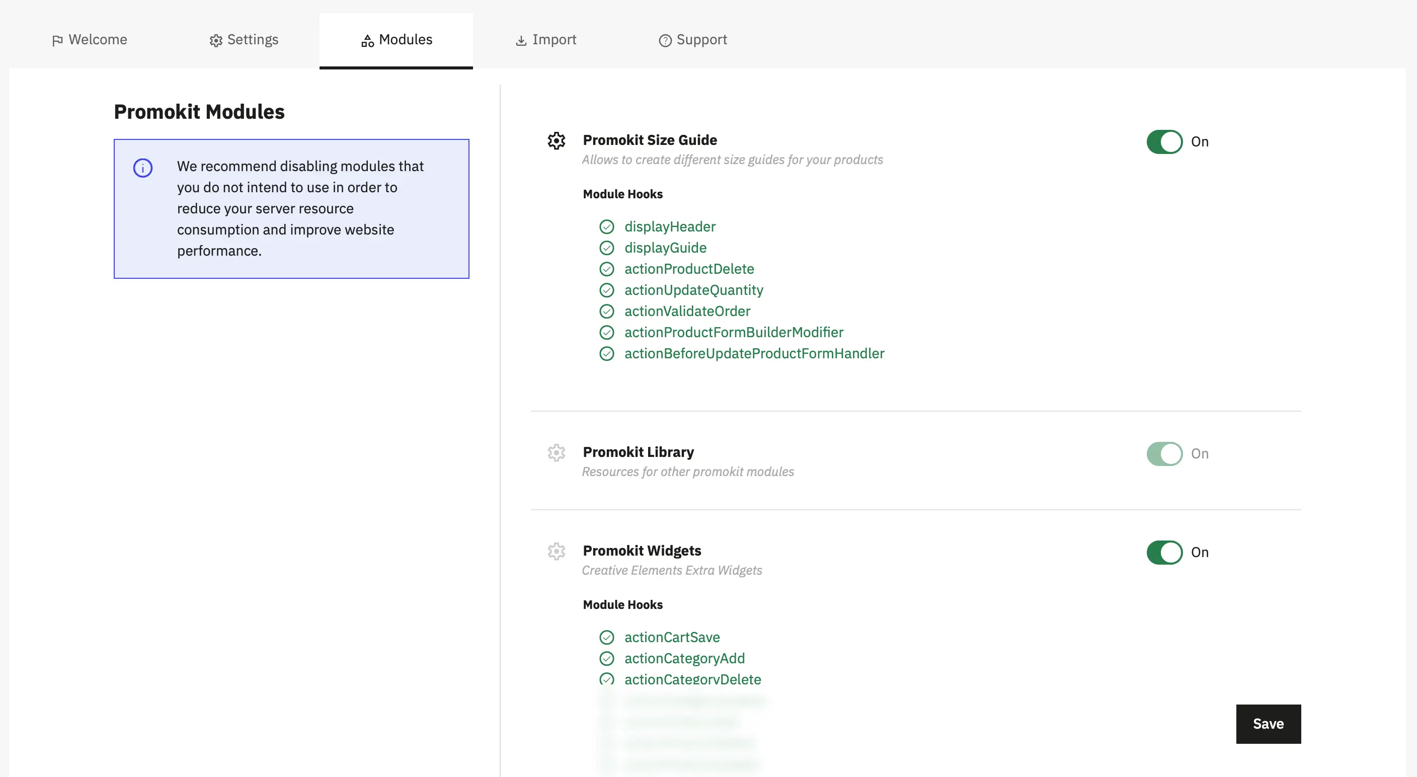
The Modules tab displays a list of all modules that ship with the theme. Each module entry shows:
- Module Name
- Module Description
- Module State Toggler
- Module Hooks — a list of all hooks required by the module with their current status:
- ✅ Hooked — the hook is properly registered and active
- ❌ Not Hooked — the hook is missing or not activated
- Fix Hooks Button — appears automatically when one or more modules have unhooked hooks. Click this button to automatically register and activate all missing hooks for affected modules.
- Module Toggle — each module has a toggle switch to enable/disable it. Disabling unused modules reduces server load and improves performance.
- Review the list and identify modules you don't need
- Toggle the switch to disable them
- If any module shows unhooked hooks, click Fix Hooks to automatically activate them
- Save your settings
Import
Import tab allows you to manually install optional theme components that are not enabled by default.
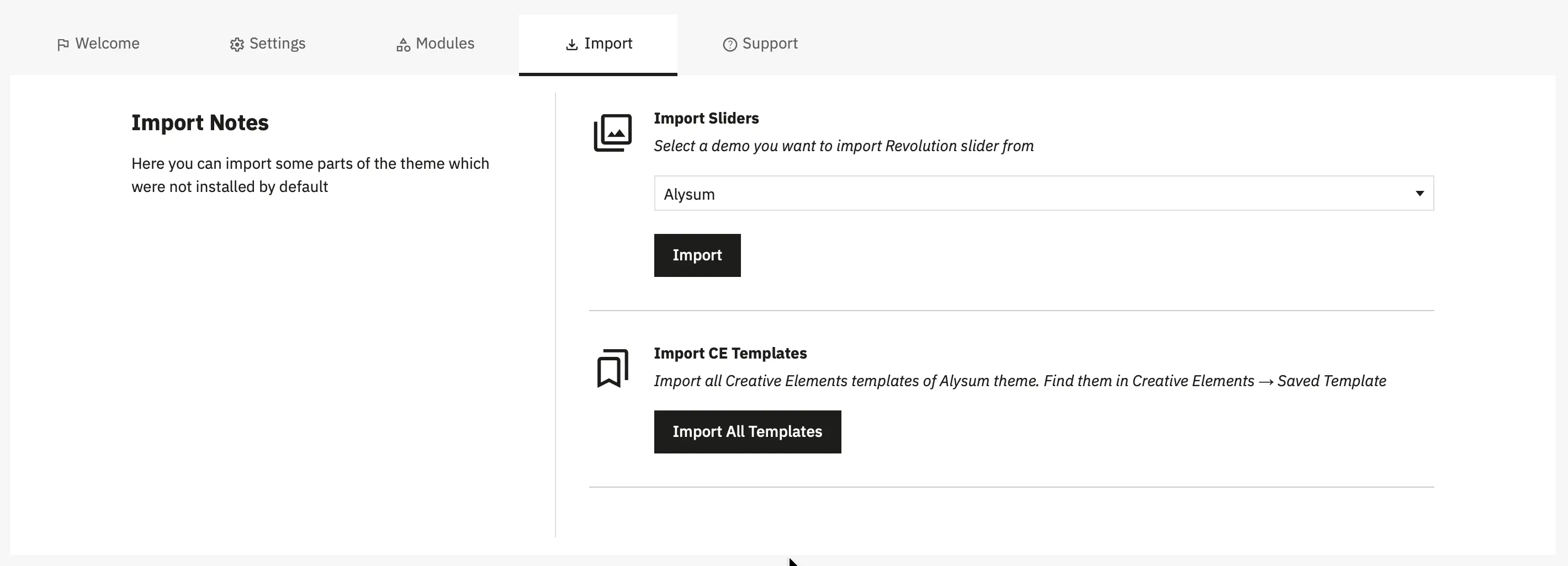
From this tab, you can:
- Import Revolution Sliders by selecting a demo and installing its slider configuration.
- Import Creative Elements templates bundled with the Alysum theme, which will then be available under Creative Elements → Saved Templates.
This section is useful if you skipped importing demo content during installation or want to add selected elements later.
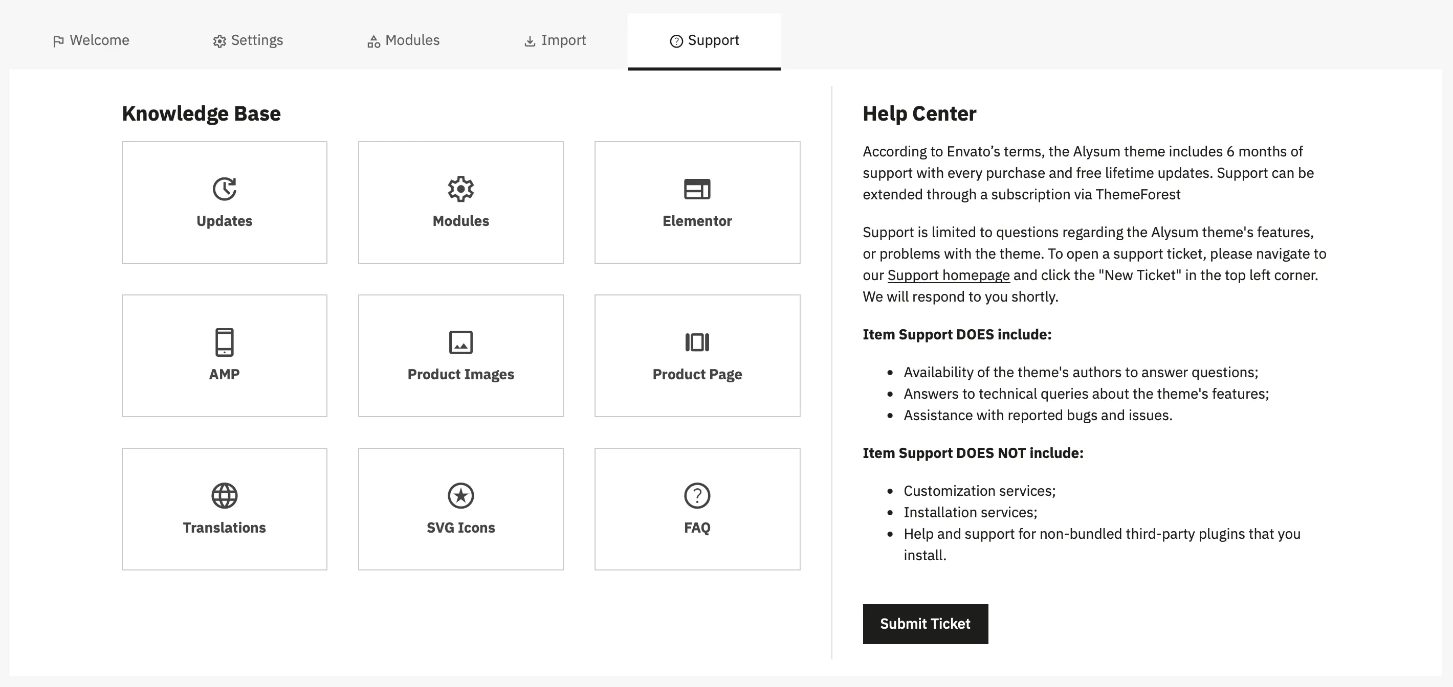
Support
The Support tab gives you quick access to documentation and official support resources for the Alysum theme.
Settings Tab
Here you can manage theme settings directly.
Presets
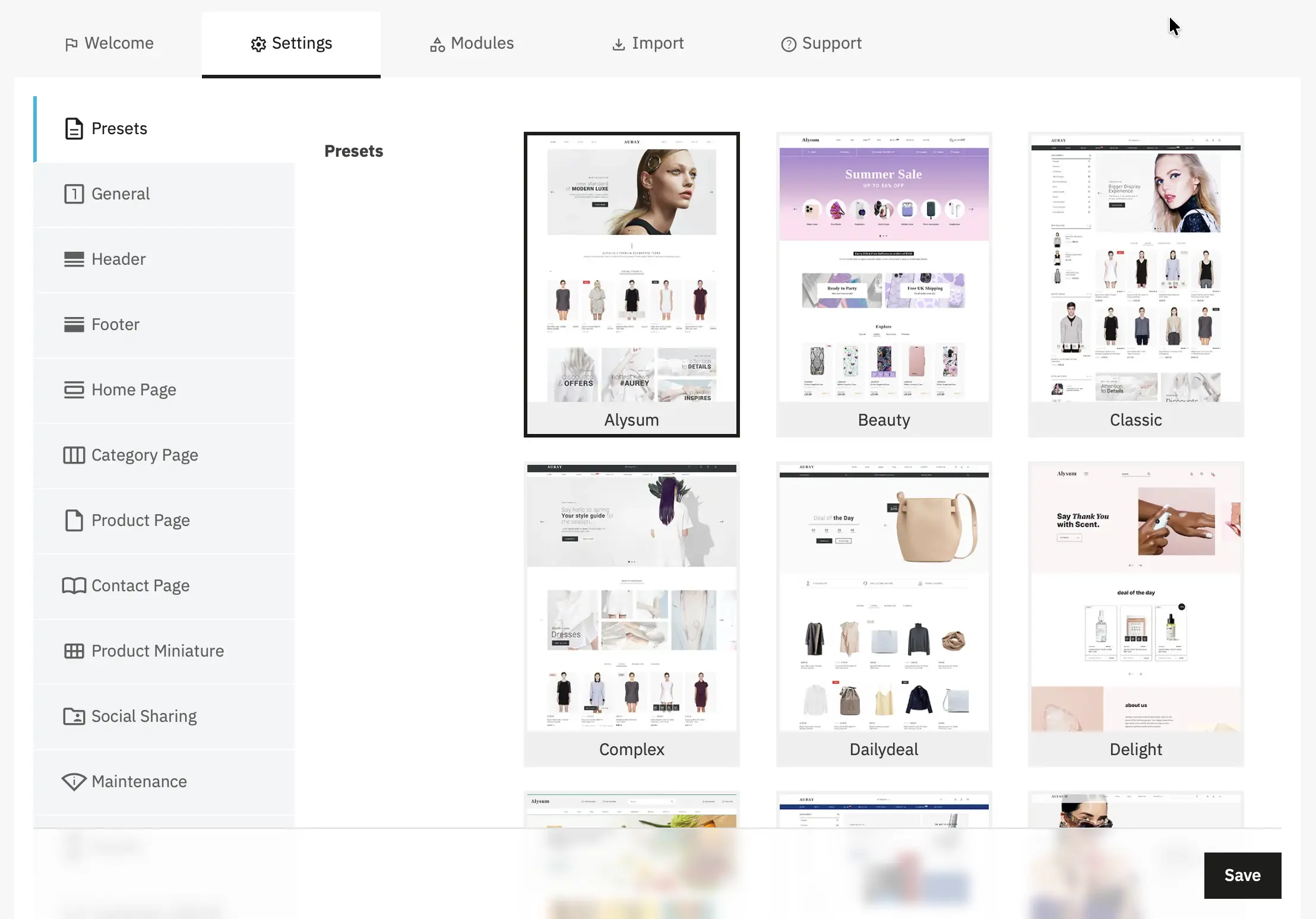
- The theme ships with presets that change multiple parts of the theme at once: Header, Footer, Home page templates, colors, typography etc...
- After changing a preset you must click Save to regenerate CSS files according to the new configuration.
General
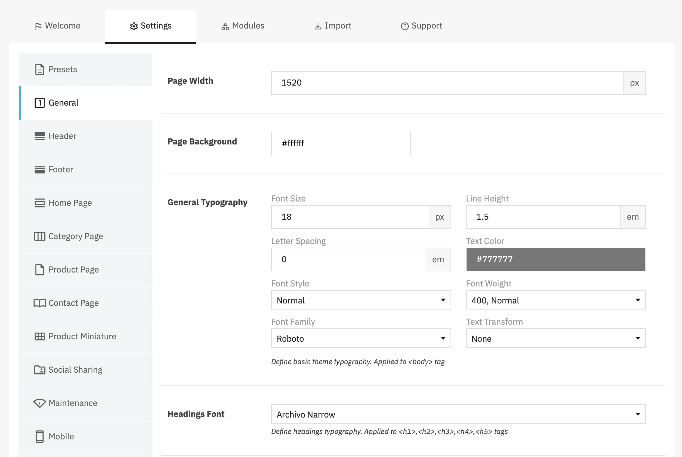
- Page Width — sets the site's max-width container.
- Page Background — sets the site's background color.
- General Typography — main site typography settings.
- Headings Font — font applied to headings (h2..h6).
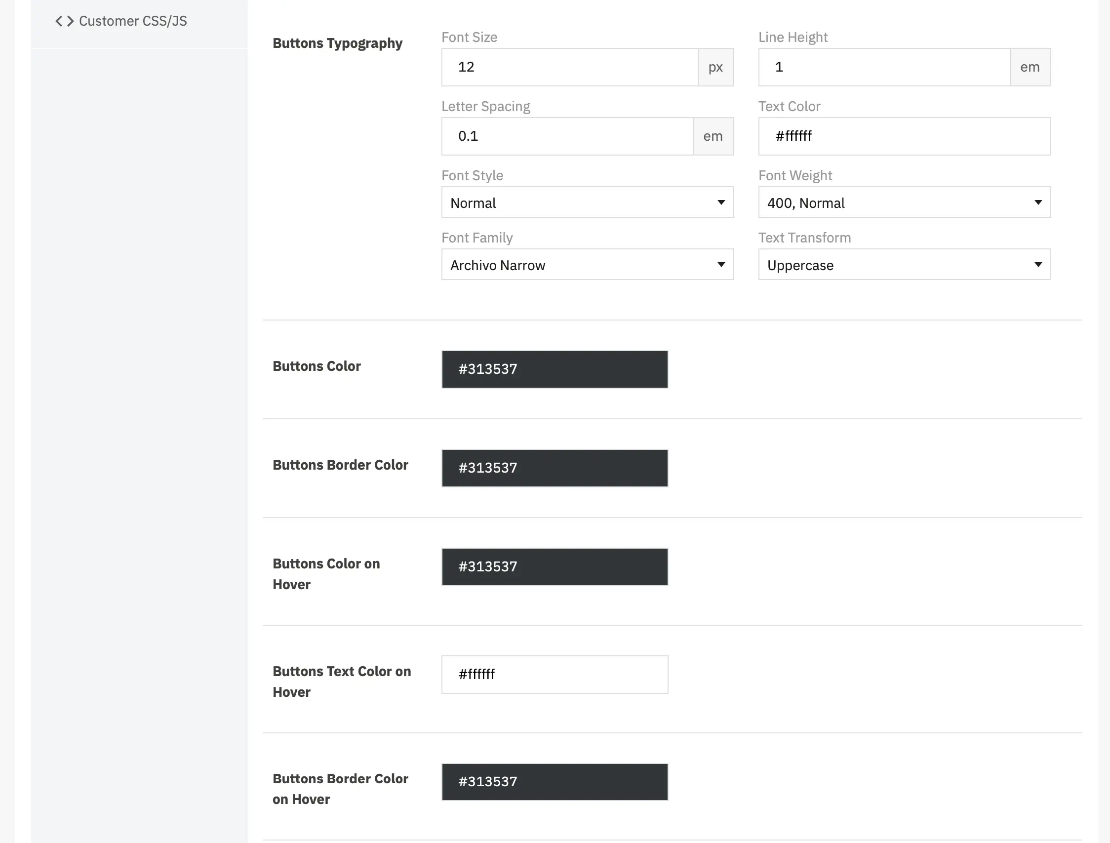
- Button Typography / Color / State — controls the
.btnstyle including hover/active/focus states.
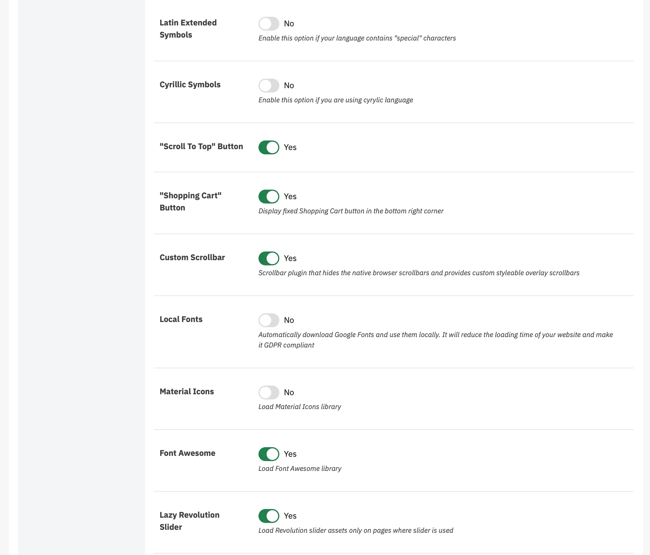
- Latin Extended — Enable this option if your language contains special characters beyond the standard Latin alphabet (such as characters with diacritics, special accents, or extended Latin characters). This ensures proper font rendering for languages like Polish, Czech, Vietnamese, and others that use extended Latin character sets.
- Cyrillic Symbols — Enable this option if you are using a Cyrillic language (such as Ukrainian, Bulgarian, Serbian, etc.). This loads the necessary font files to properly display Cyrillic characters throughout your website.
- Scroll To Top — When enabled, displays a floating button in the bottom right corner of the page that allows users to quickly scroll back to the top of the page. This improves user experience on long pages by providing easy navigation back to the header.
- "Shopping Cart" Button - Display a fixed Shopping Cart button in the bottom right corner of the page. This provides quick access to the cart from anywhere on your website, improving the checkout experience and potentially increasing conversions. The button shows a floating cart icon that remains visible as users scroll.
- Custom Scrollbar - A scrollbar plugin that hides the native browser scrollbars and provides custom styleable overlay scrollbars. This creates a more polished, consistent appearance across different browsers and allows for better design control. The custom scrollbars can be styled to match your theme's color scheme.
- Local Fonts - When enabled, automatically downloads Google Fonts and hosts them locally on your server instead of loading them from Google's CDN. This provides two key benefits:
- Reduced loading time: Fonts load faster from your own server
- GDPR compliance: Eliminates the connection to Google servers, helping meet EU privacy regulations
- Material Icons - Load the Material Icons library, a comprehensive icon font developed by Google. Enable this if you're using Material Icons in your custom content, widgets, or design elements. When to enable: Only enable if you're actively using Material Icons to avoid loading unnecessary resources.
- Font Awesome - Load the Font Awesome icon library. Font Awesome is one of the most popular icon libraries and is used throughout the Alysum theme for various interface elements, social media icons, and decorative elements. _Recommendation: Keep this enabled unless you're certain you're not using any Font Awesome icons anywhere on your site._partials
- Lazy Revolution Slider - When enabled, Revolution Slider assets (JavaScript and CSS files) are only loaded on pages where a Revolution Slider is actually used. This improves page load times and performance on pages that don't contain sliders.
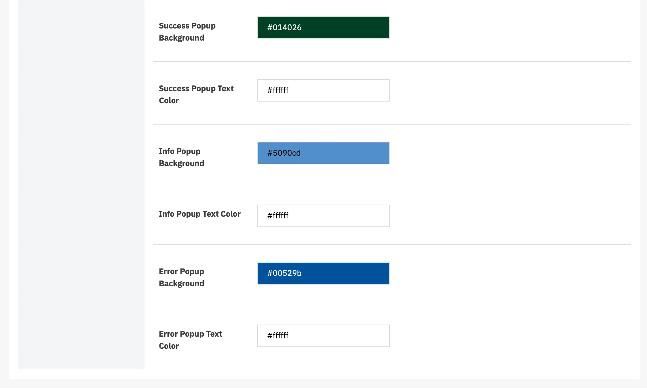
The block of settings above configures the appearance of notification popups
Header
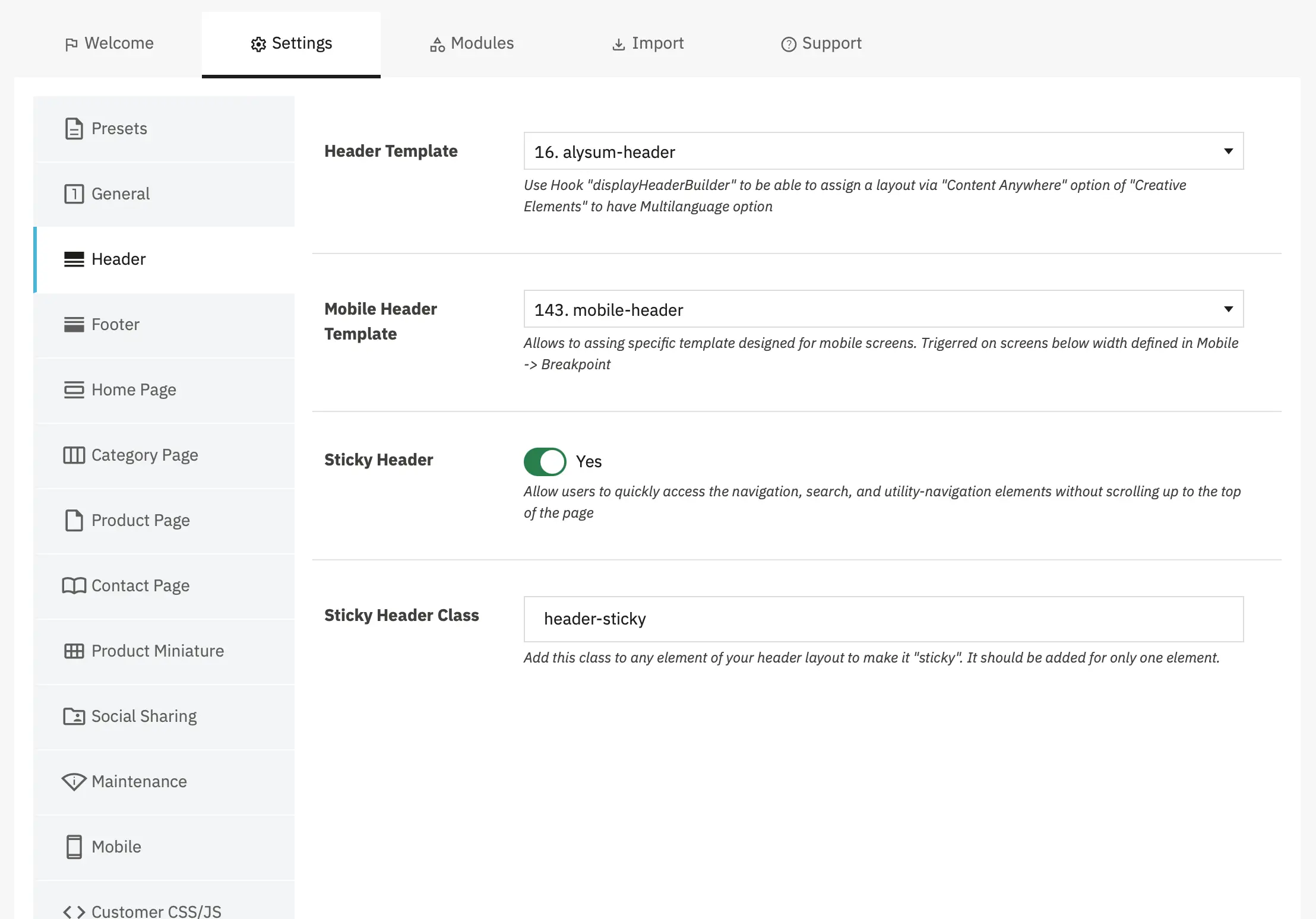
- Header Template — Select the Creative Elements template to use for your main website header.
- Mobile Header Template — Allows you to assign a specific template designed for mobile screens. This template is triggered automatically on screens below the width defined in
Mobile→Breakpointsettings.
- Sticky Header — When enabled, the header remains fixed at the top of the viewport as users scroll down the page. This allows users to quickly access navigation, search, and utility elements without scrolling back to the top.
- Sticky Header Class — Add this CSS class to any element in your header layout to make it "sticky." When a user scrolls down, only the element with this class will remain fixed at the top of the page.
Footer
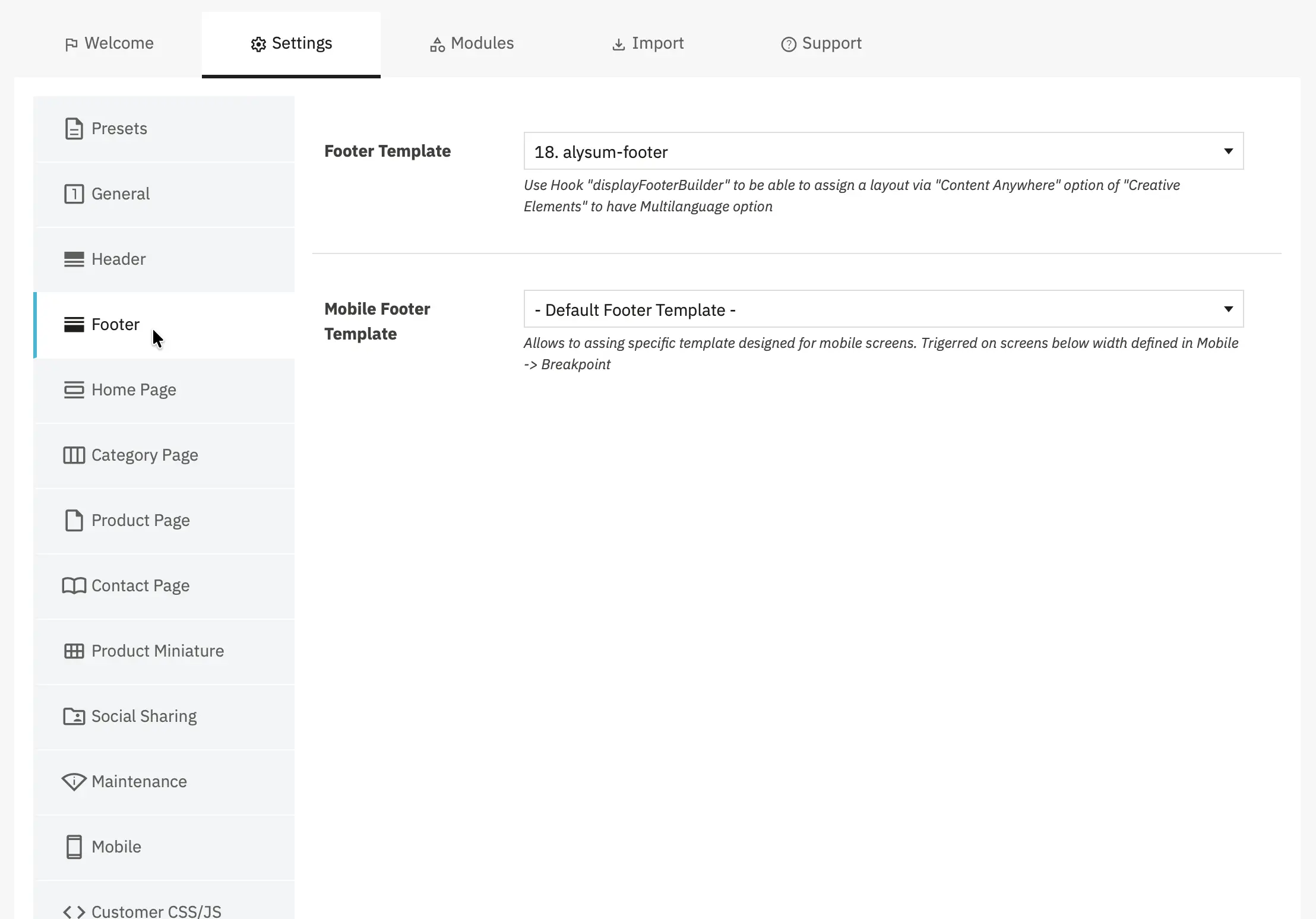
- Footer Template — Select the Creative Elements template to use for your main website footer.
- Mobile Footer Template — Allows you to assign a specific template designed for mobile screens. This template is triggered automatically on screens below the width defined in
Mobile→Breakpointsettings.
Home Page
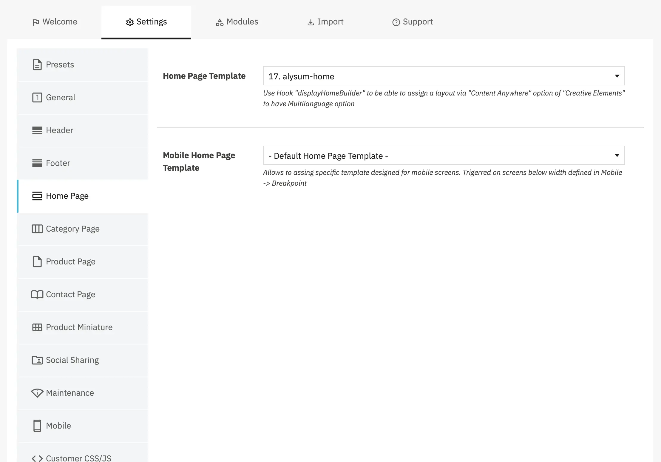
- Home Page Template — Select the Creative Elements template to use for your Home Page. This dropdown displays all available templates that you've created in Creative Elements.
- Mobile Home Page Template — Allows you to assign a specific template designed for mobile screens. This template is triggered automatically on screens below the width defined in
Mobile→Breakpointsettings.
Category Page
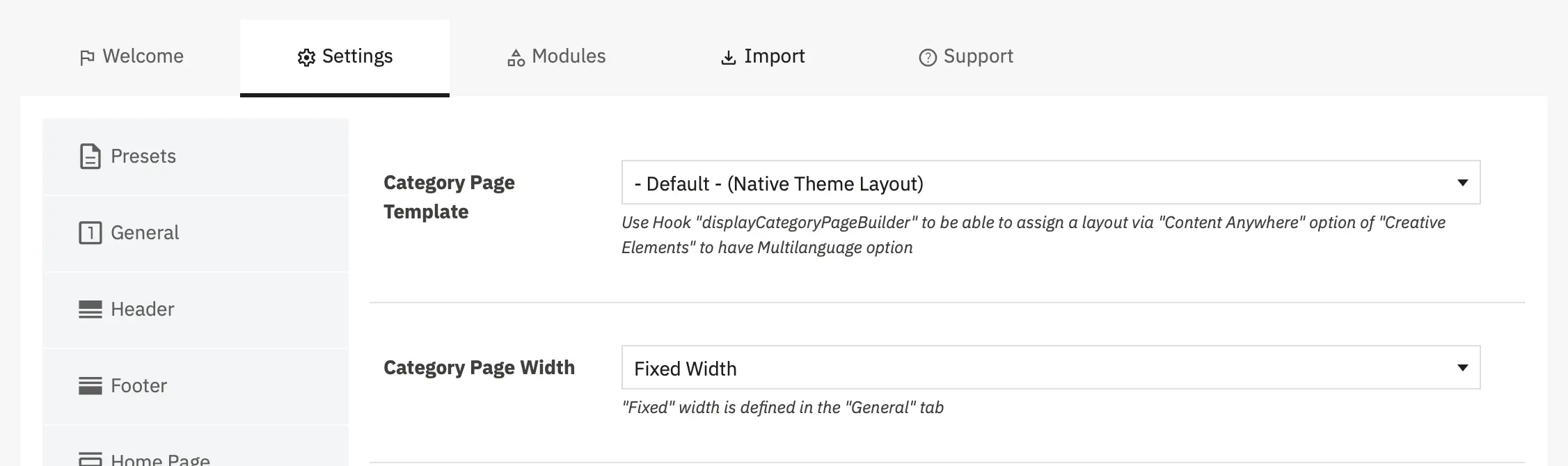
- Category Page Template — Select the Creative Elements template to use for your Category Page.
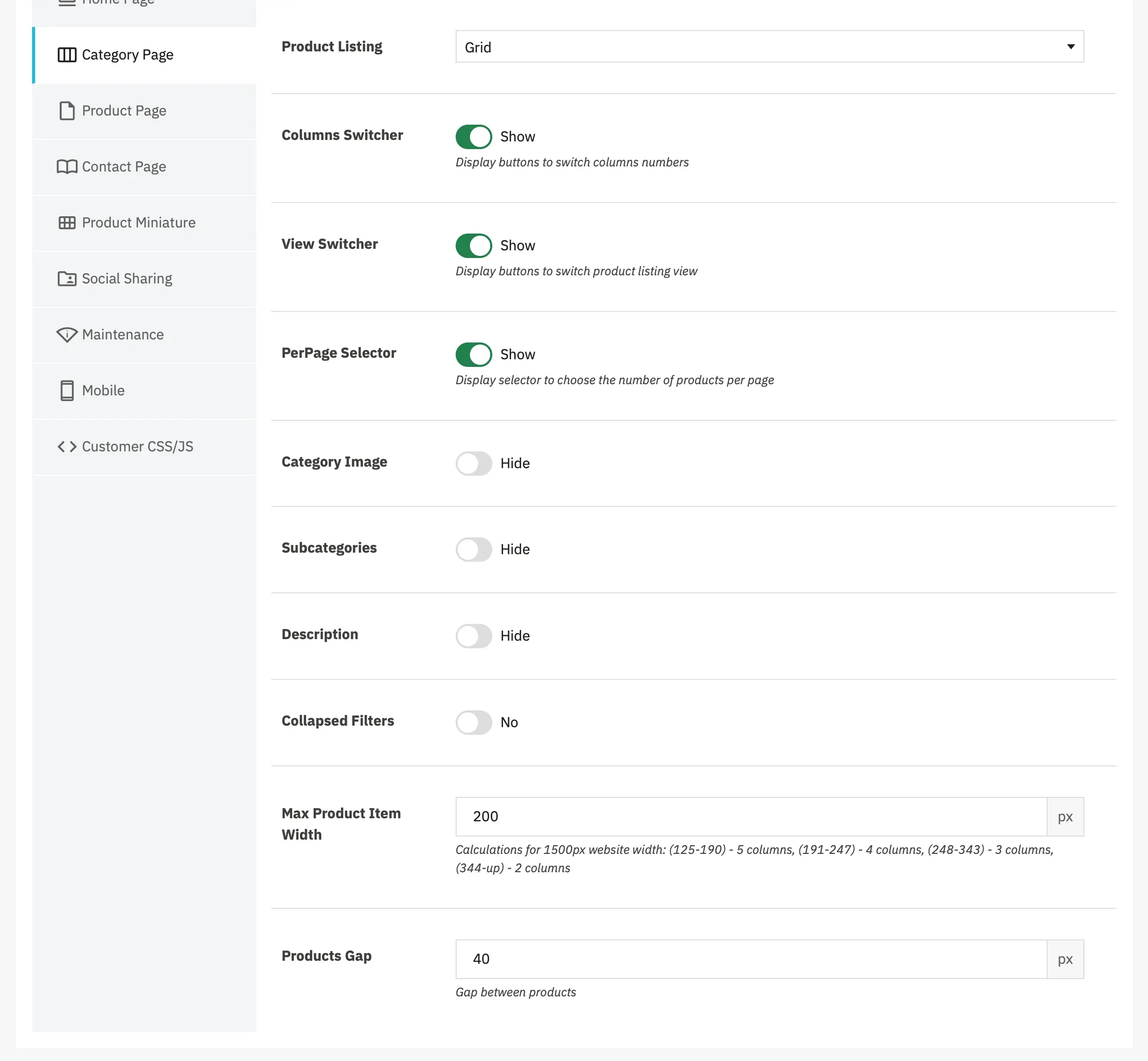
- Product listing – Choose how products are displayed on category pages:
Grid: Products are displayed in a grid layout with multiple columns.
List: Products are displayed in a single-column list format with more detailed information visible for each product.
- Columns Switcher - Display buttons that allow customers to switch the number of columns in the grid view (e.g., 2 columns, 3 columns, etc...).
- View Switcher - Display buttons to switch between Grid and List product listing views.
- PerPage Selector - Display a selector that allows customers to choose the number of products displayed per page (e.g., 12, 24, 36, 48 products per page).
- Category Image - Control whether the category image (banner) is displayed at the top of category pages.
- Subcategories - Display subcategories on category pages, typically shown above the product listing.
- Description - Display the category description on category pages.
- Collapsed Filters - Control whether product filters (faceted search) are collapsed by default on category pages.
- Max Product Item Width - Set the maximum width (in pixels) for individual product items in the grid layout. This setting controls responsive behavior and determines how many columns appear at different screen widths.
How it works: The theme calculates the number of columns based on:
- Available container width
- This maximum item width setting
- Products Gap setting
Layout sizing hint: for a 1500px site width choose product item widths according to desired columns:
(125-190) → 5 columns
(191-247) → 4 columns
(248-343) → 3 columns
(344-up) → 2 columnsSmaller values (150-200px): More columns, more products visible, denser layout Larger values (250-350px): Fewer columns, larger product images, more spacious layout Typical range: 180-250px for most stores
- Products Gap - Set the gap (spacing) between products in the grid layout, in pixels.
Product Page
Customize the layout and typography of your product pages to match your brand identity and enhance the shopping experience.
-
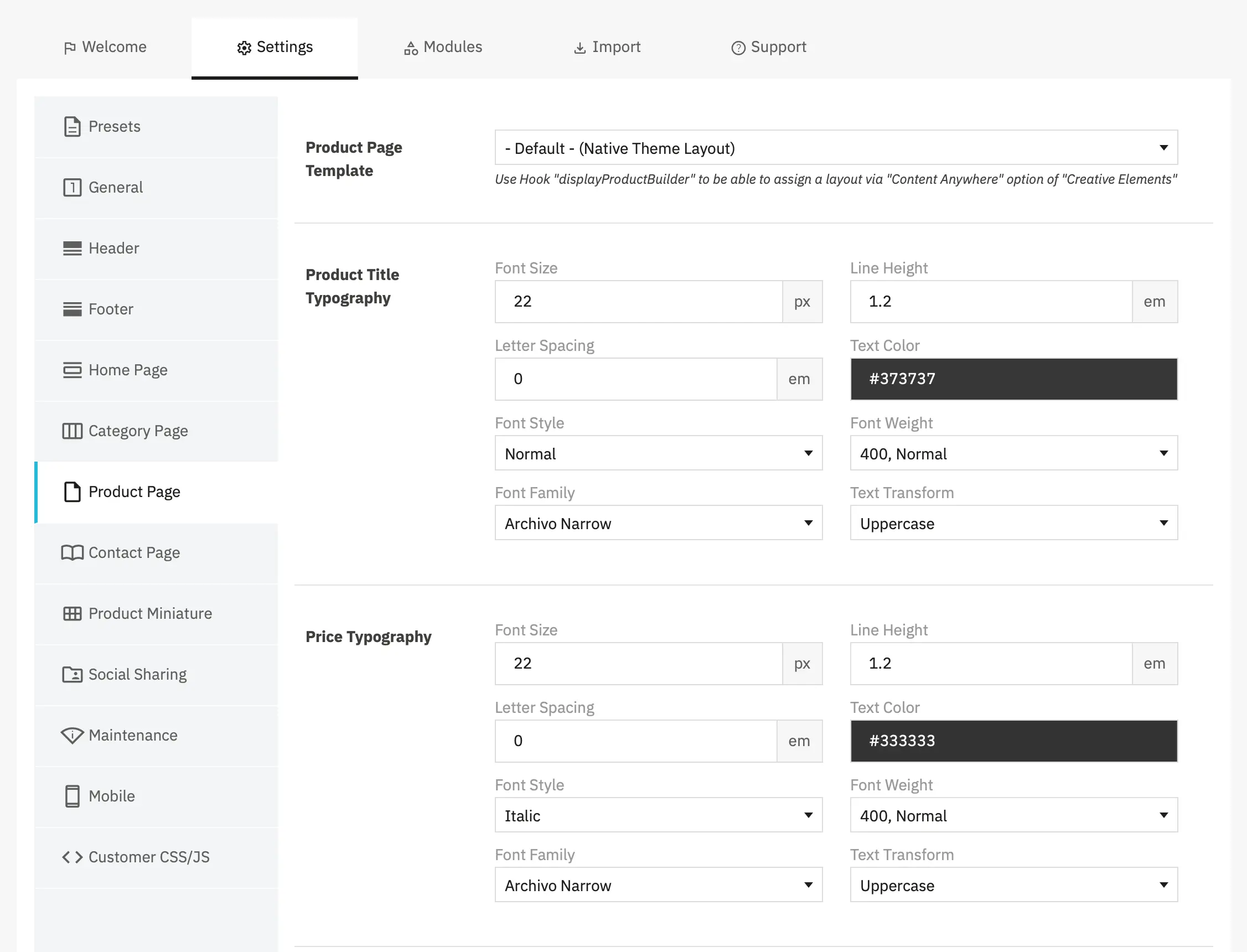
Product Page Template - Select a custom Creative Elements template for your product pages. This allows you to completely customize the product page layout using the CE page builder.
Options:Default (Native Theme Layout): Uses the standard Alysum product page layoutCustom Templates: Any product page templates you've created in Creative Elements
- Product Title Typography - Control the appearance of the product title (product name) on product pages.
- Price Typography - Control the appearance of the product price on product pages. Settings work the same way as Product Title Typography.
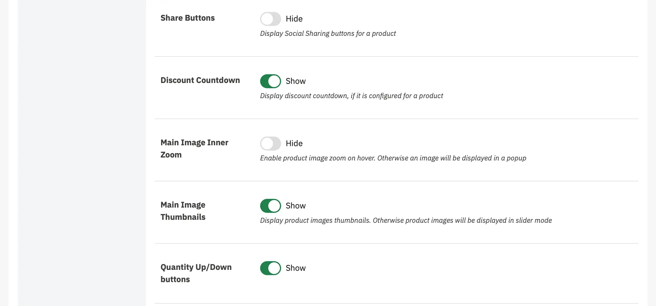
- Product Page Display Settings - Display social sharing buttons on product pages, allowing customers to share products on social media platforms.
- Discount Countdown - Display a countdown timer on product pages when a time-limited discount is configured for a product.
- Main Image Inner Zoom - Enable zoom functionality that displays a magnified version of the product image when customers hover over it.
- Main Image Thumbnails - Display product image thumbnails below or beside the main product image.
- Quantity Up/Down Buttons - Display increment (+) and decrement (-) buttons next to the quantity input field on product pages.
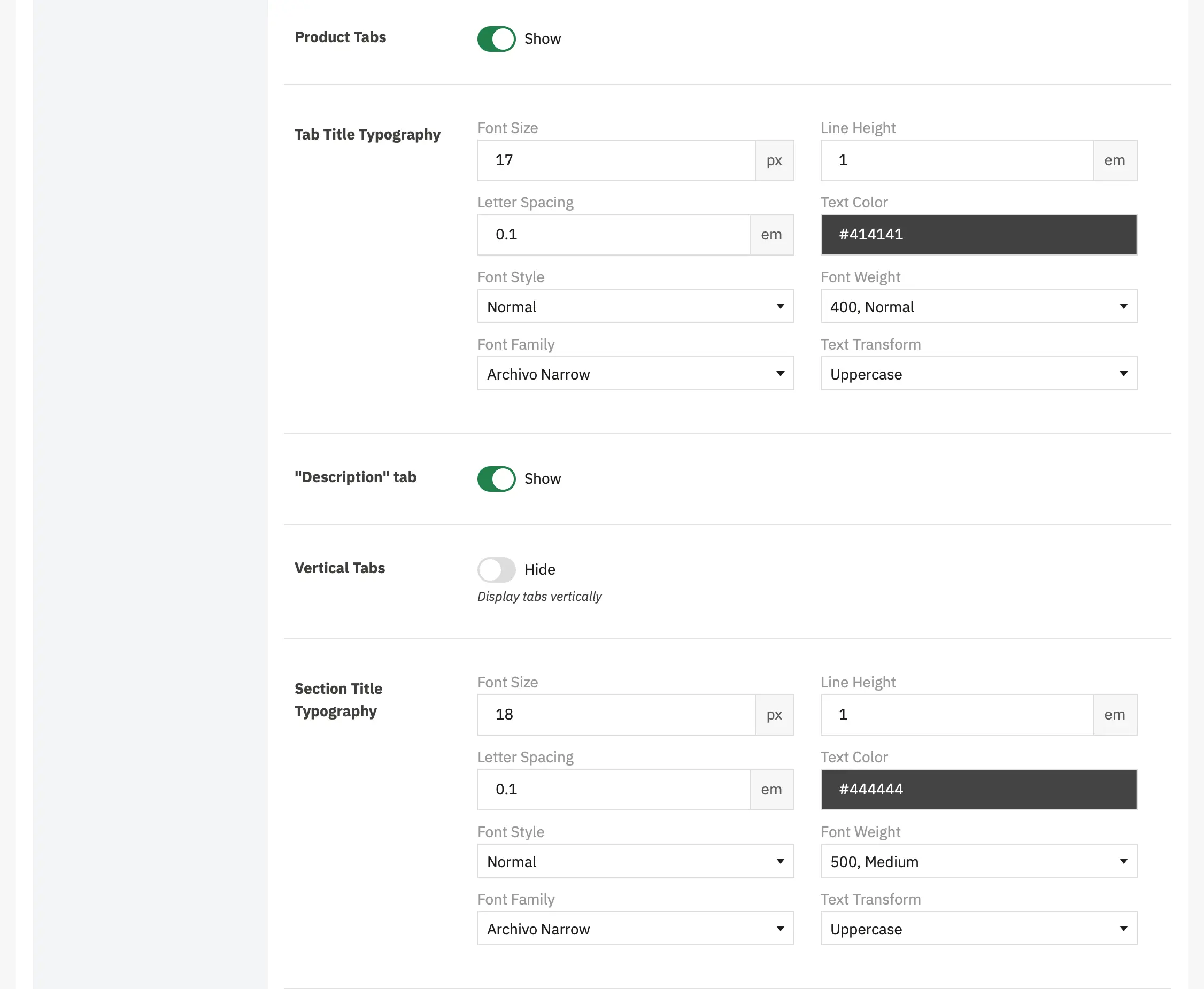
- Product Tabs - Control whether tabbed product information sections are displayed on product pages.
- Tab Title Typography - Control the appearance of tab titles (the clickable tab headers).
- "Description" Tab - Control whether the "Description" tab specifically is displayed.
- Vertical Tabs - Display tabs vertically (stacked on the left or right side) instead of horizontally (in a row across the top).
- Section Title Typography - Control the appearance of section headings within tab content (e.g., "Specifications," "Features," "Ingredients" headings inside the Description or Product Details tab).
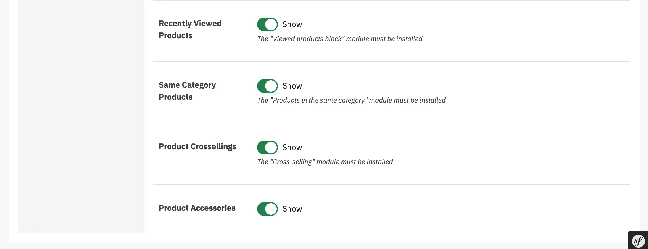
- Recently Viewed Products - Display a section showing products that the customer has recently browsed during their current session.
- Same Category Products - Display products from the same category as the currently viewed product.
- Product Crossellings - Display products that have been purchased together with the current product by other customers.
- Product Accessories - Display manually assigned accessory products for the current product.
Contact Page
-
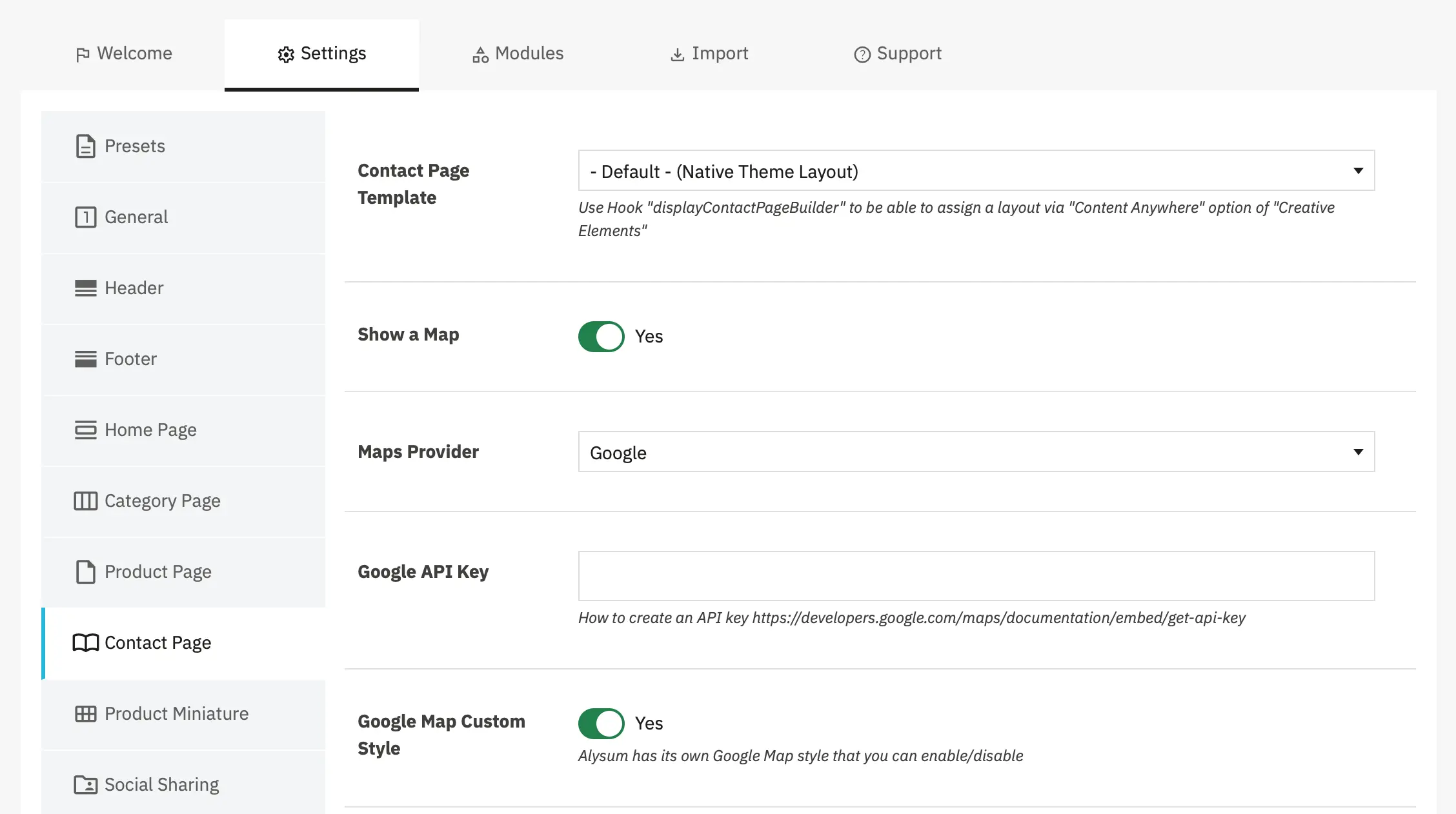
Contact Page Template - Select a custom Creative Elements template for your contact page. This allows you to completely customize the contact page layout using the drag-and-drop builder.
Options:- Default (Native Theme Layout): - Uses the standard PrestaShop/Alysum contact page layout
- CE Template: - Any templates you've created in Creative Elements
- Show a Map - Control whether an interactive map is displayed on the contact page showing your store location.
-
Maps Provider - Select which map service to use for displaying your store location.
Options: Google, Leaflet
- Google API Key - Enter your Google Maps JavaScript API key to enable Google Maps functionality.
- Google Map Custom Style - Enable or disable Alysum's custom styling for Google Maps to match your theme design.
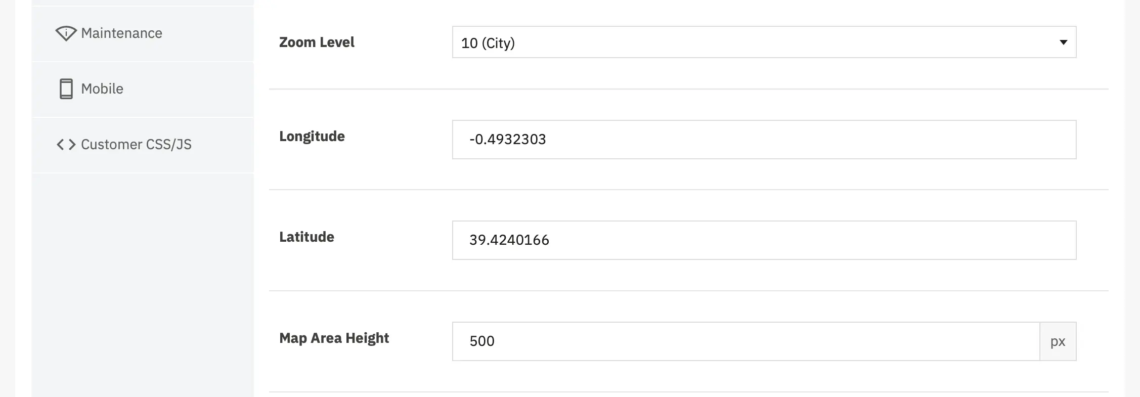
- Zoom Level - Set the initial zoom level when the map loads on the contact page. Default: 10 (City) The zoom level determines how close or far the map view is when it first loads
Zoom level reference:
1-3 (World/Continent): Shows entire continents or large regions
4-6 (Country): Shows countries or large states
7-9 (Region/State): Shows states, provinces, or regions
10-12 (City): Shows cities and surrounding areas (recommended)
13-15 (Streets): Shows neighborhoods and street-level detail
16-18 (Building): Shows individual buildings and precise locations
19-20 (Maximum): Extremely close, building-level detail- Longitude - The longitude coordinate of your store location. Format: Decimal degrees (e.g., -0.4932303)
- Latitude - The latitude coordinate of your store location. Format: Decimal degrees (e.g., 39.4240166)
- Map Area Height - Set the height of the map container on the contact page.
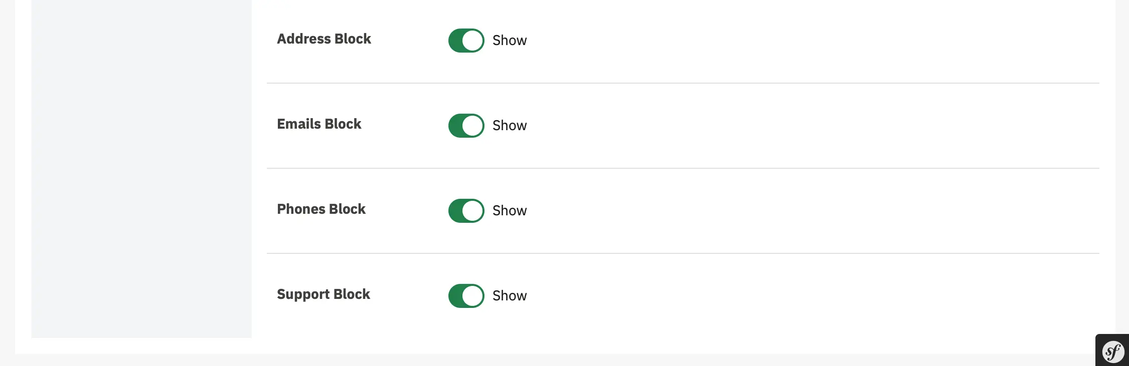
Each block above displays a specific piece of contact information that you can individually show or hide
Product Miniature
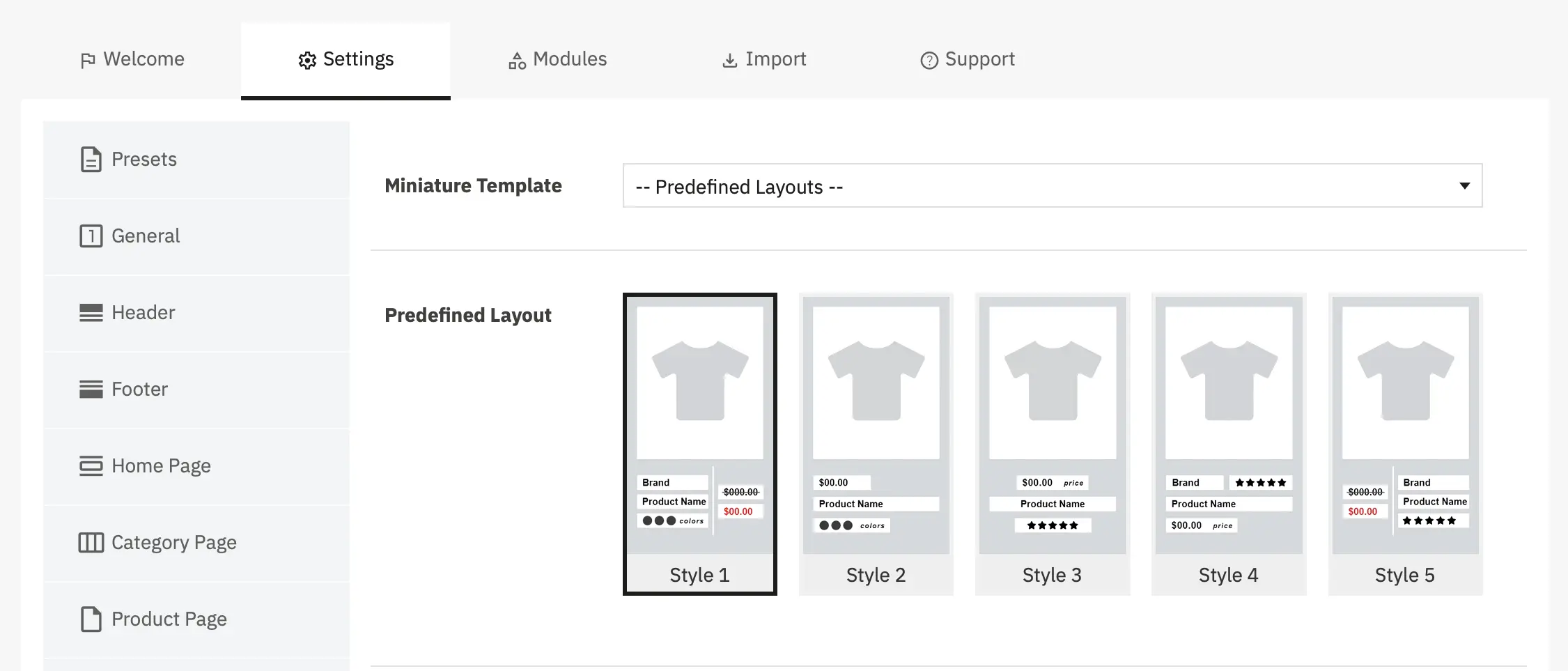
- Miniature Template - Select a predefined layout template for your product miniatures or use Creative Elements for complete customization.
When set to Predefined Layouts:
- You can select from 5 predefined styles (see Predefined Layout below)
- All configuration options below remain available
- You can customize individual elements (brand, price, reviews, etc.)When a Creative Elements template is selected:
- The predefined layout options below become unavailable
- Complete control over product miniature design using CE builder- Predefined Layout - Choose from 5 pre-designed product miniature styles that control the visual arrangement and display of product information.
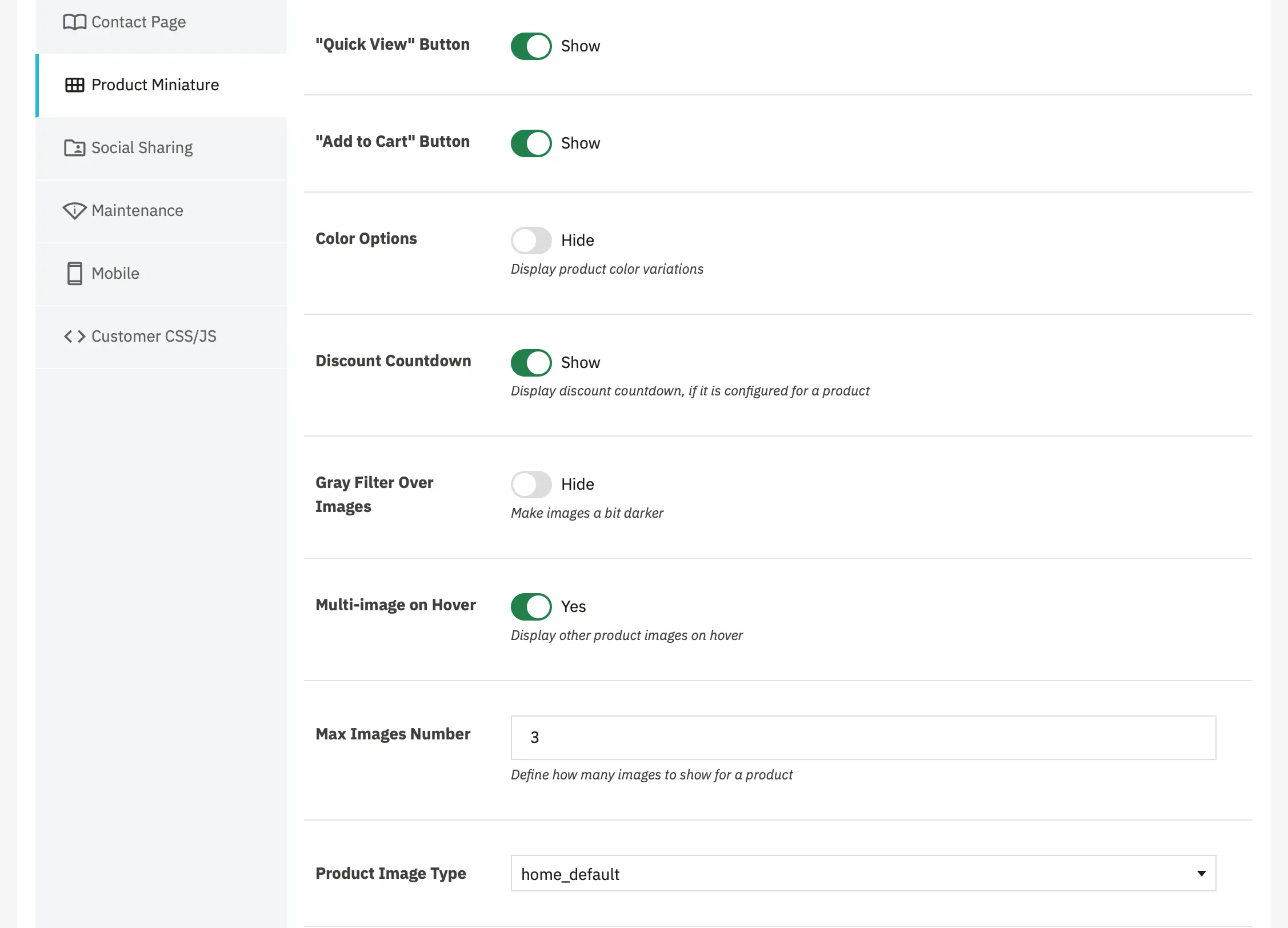
- "Quick View" Button - Display a Quick View button on product miniatures that opens a popup with product details.
- "Add to Cart" Button - Display an Add to Cart button directly on product miniatures.
- Color Options - Display product color variations as swatches on product miniatures.
- Discount Countdown - Display a countdown timer on product miniatures when a time-limited discount is active
- Gray Filter Over Images - Apply a slight gray overlay/filter to product images on miniatures.
- Multi-image on Hover - Display additional product images when hovering over a product miniature.
- Max Images Number - Define how many images to show when hovering over a product miniature.
- Product Image Type - Select which image size/format to use for product miniatures.
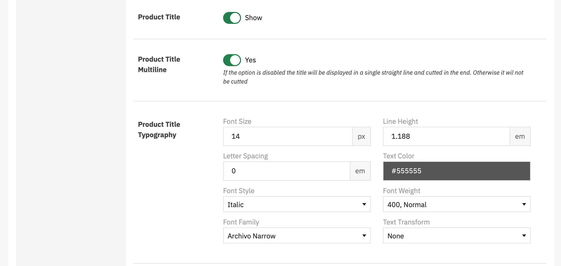
- Product Title - Display the product name/title on product miniatures.
- Product Title Multiline - Allow product titles to wrap to multiple lines instead of truncating.
- Product Title Typography - Control the visual appearance and styling of product titles on miniatures.
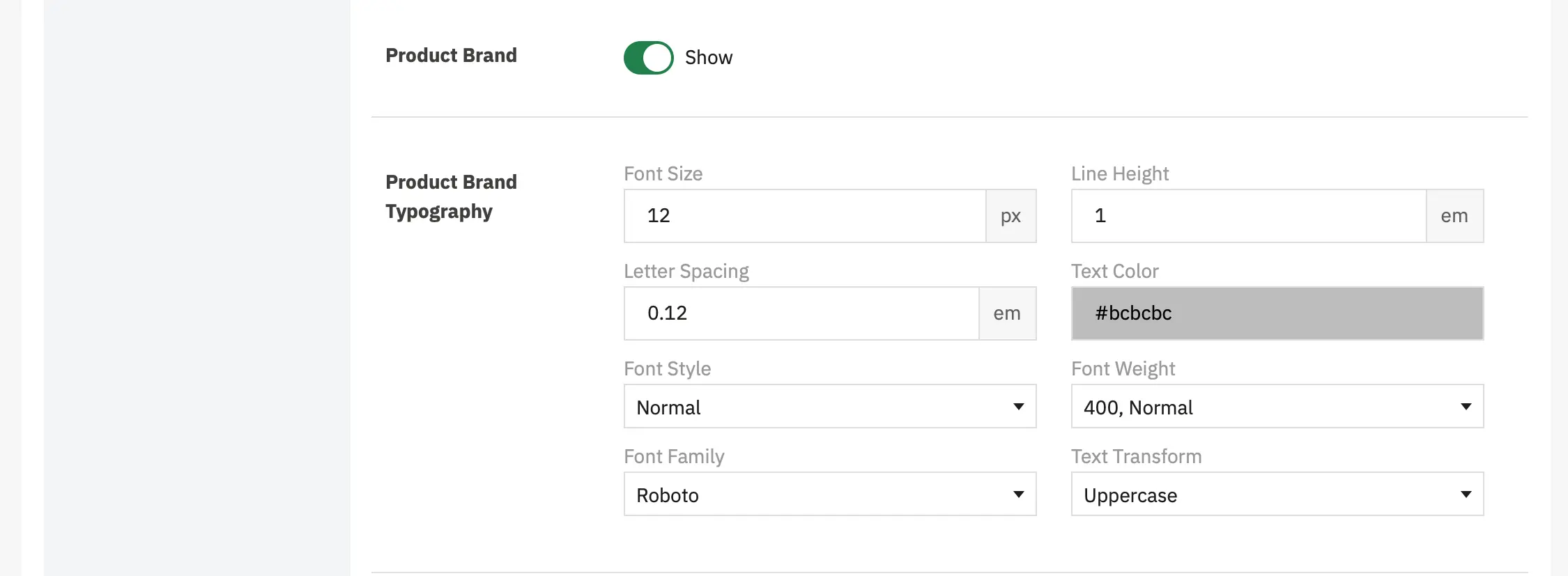
- Product Brand - Display product brand
- Product Brand Typography - Control the visual appearance and styling of product brand on miniatures.
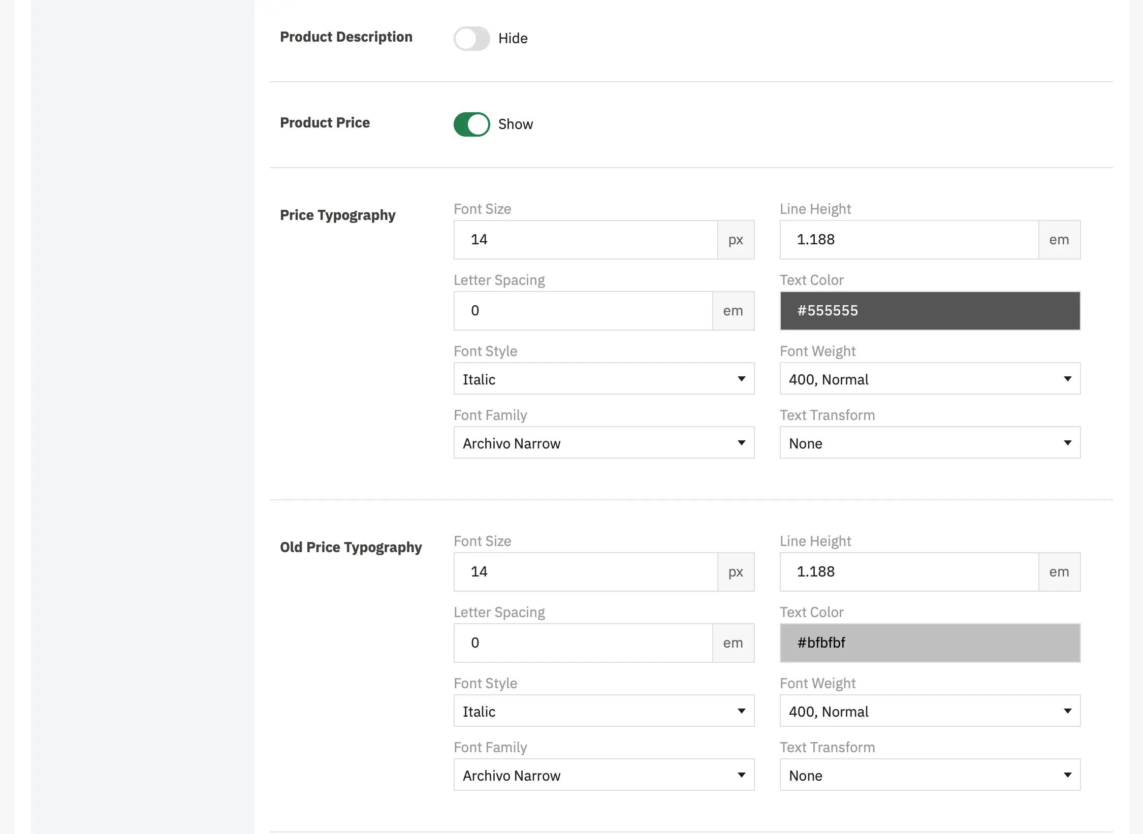
- Product Description - Display product description
- Product Price - Display product price
- Price Typography - Control the visual appearance and styling of the current product price on miniatures.
- Old Price Typography - Control the visual appearance and styling of the original product price on miniatures.
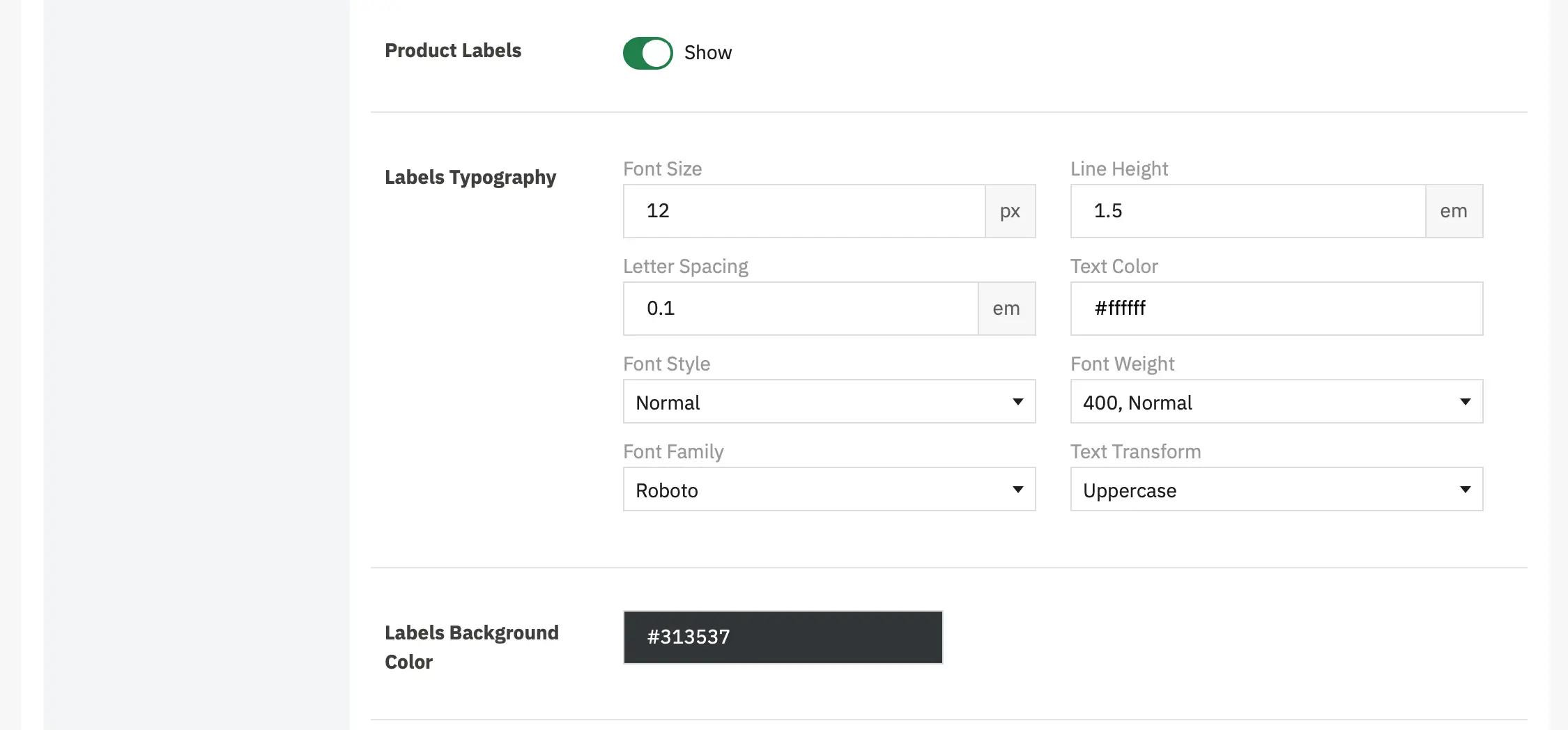
- Product Labels - Display product labels, like New, Discount, etc...
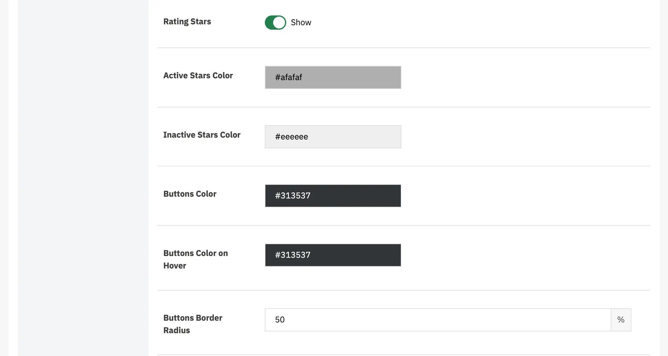
- Rating Stars - Display product rating stars on product miniatures
- Active Stars Color - Set the color for filled/active rating stars.
- Inactive Stars Color - Set the color for empty/inactive rating stars.
- Buttons Color - Set the background color for buttonss, such as "Add to Cart," "Quick View," or other action buttons, on product miniatures.
- Buttons Color on Hover - Set the background color for buttons when hovering over them.
- Buttons Border Radius - Set the roundness of button corners on product miniatures

- Display Attribute - Display a specific product attribute on product miniatures.
- Display Feature - Display a specific product feature on product miniatures.
Social Sharing
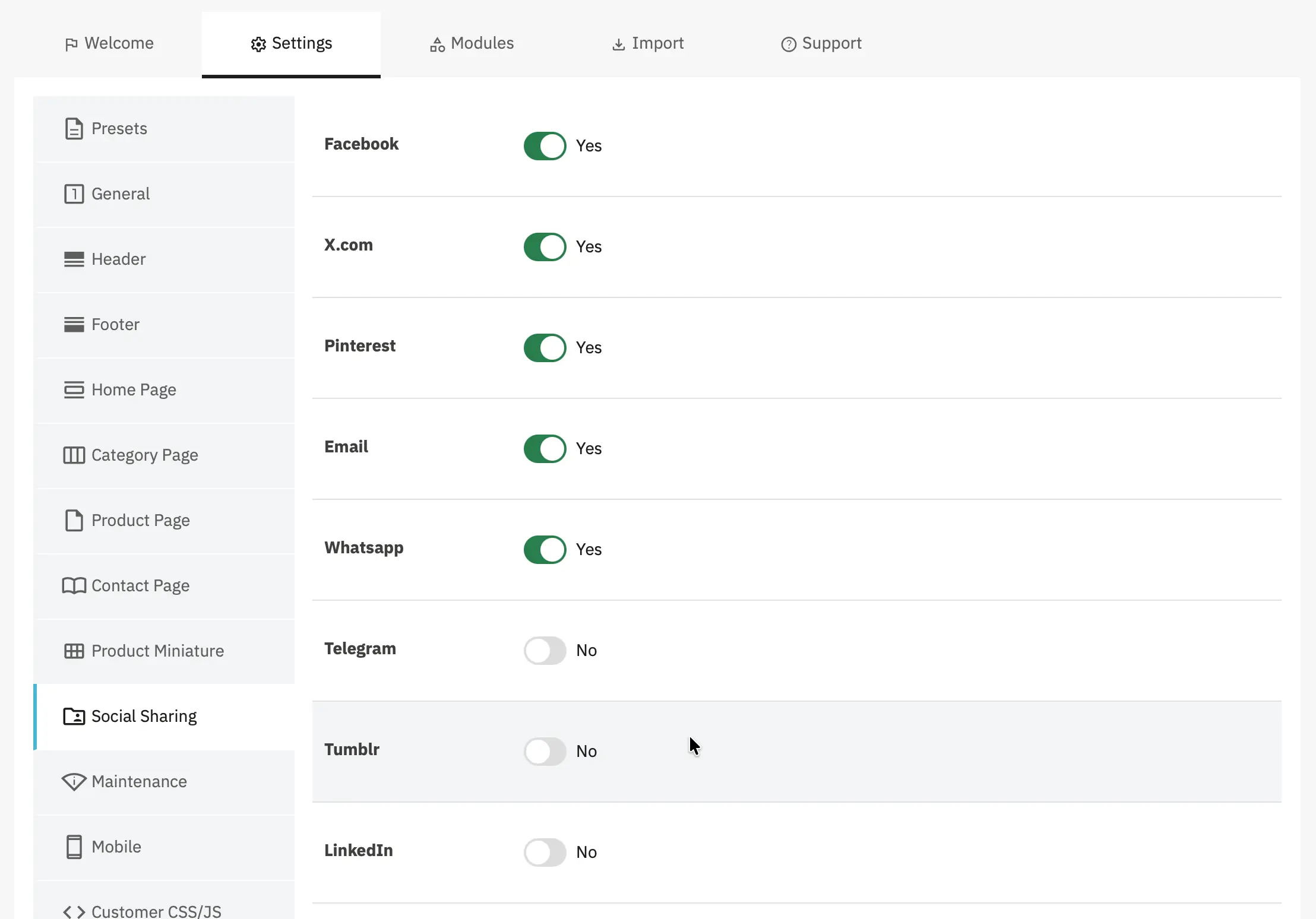
- Theme provides social sharing buttons for product pages; configure which networks are shown in the Social Sharing section of the settings.
Maintenance
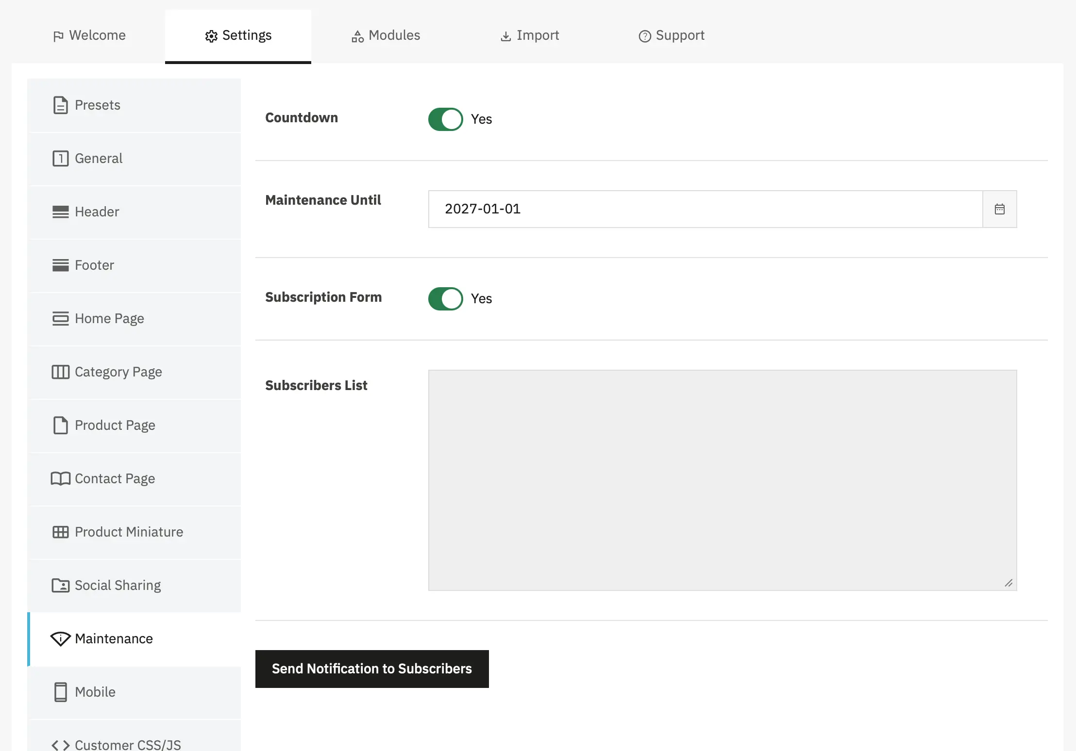
- Maintenance mode — enable/disable maintenance.
- Countdown — show a countdown on the maintenance page and set the reopening date.
- Subscription form — enable a subscription form to collect emails while in maintenance.
- Subscribers list & Send Notification — manage subscribers and notify them when the store is reopened.
Mobile
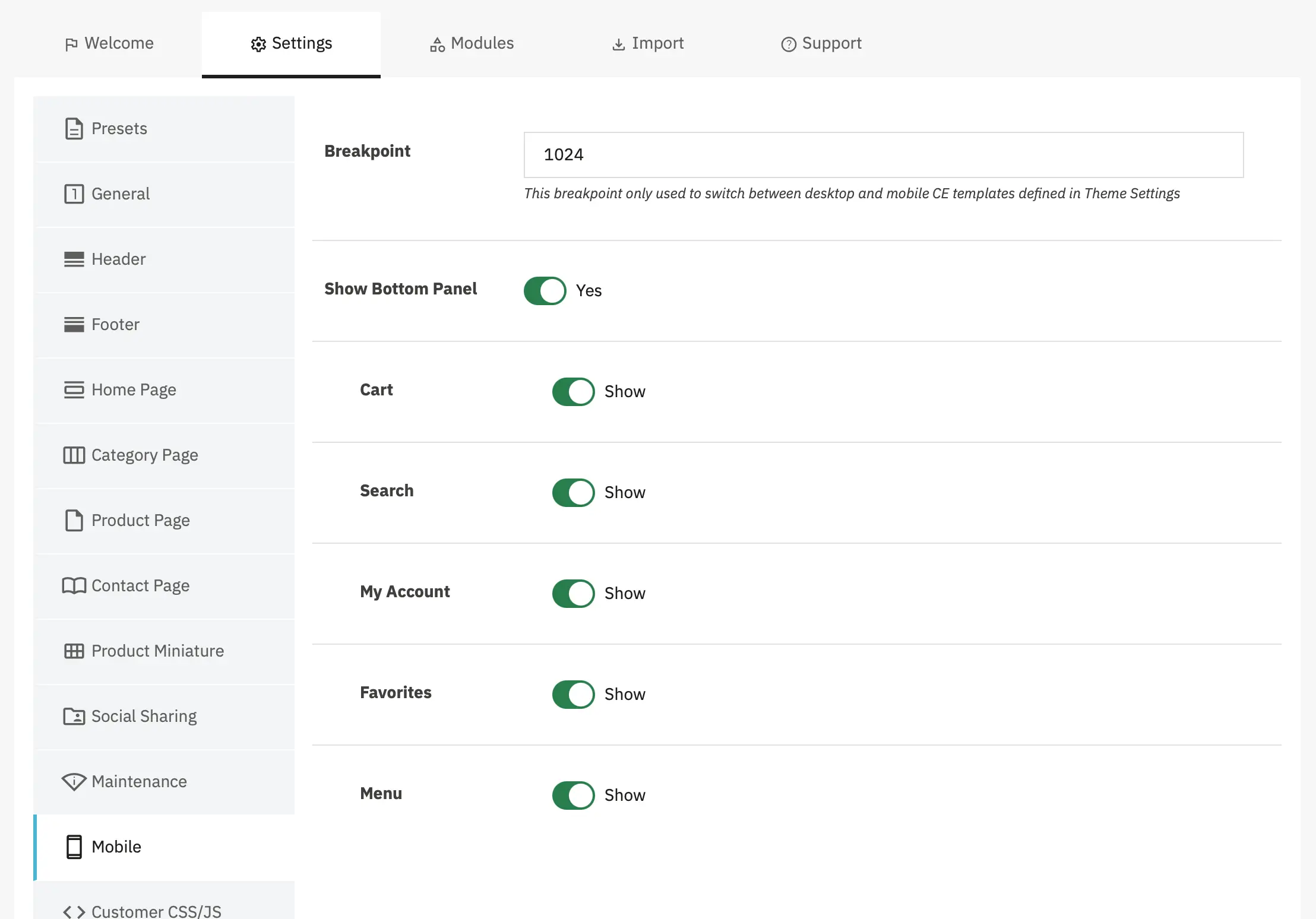
- Breakpoint - this breakpoint is used in cases such as displaying the mobile template, re-rendering sliders with specific mobile settings, etc.
- Show Bottom Panel - a panel with “hot links” such as cart, menu, and search, displayed on mobile screens only.
Customer CSS/JS
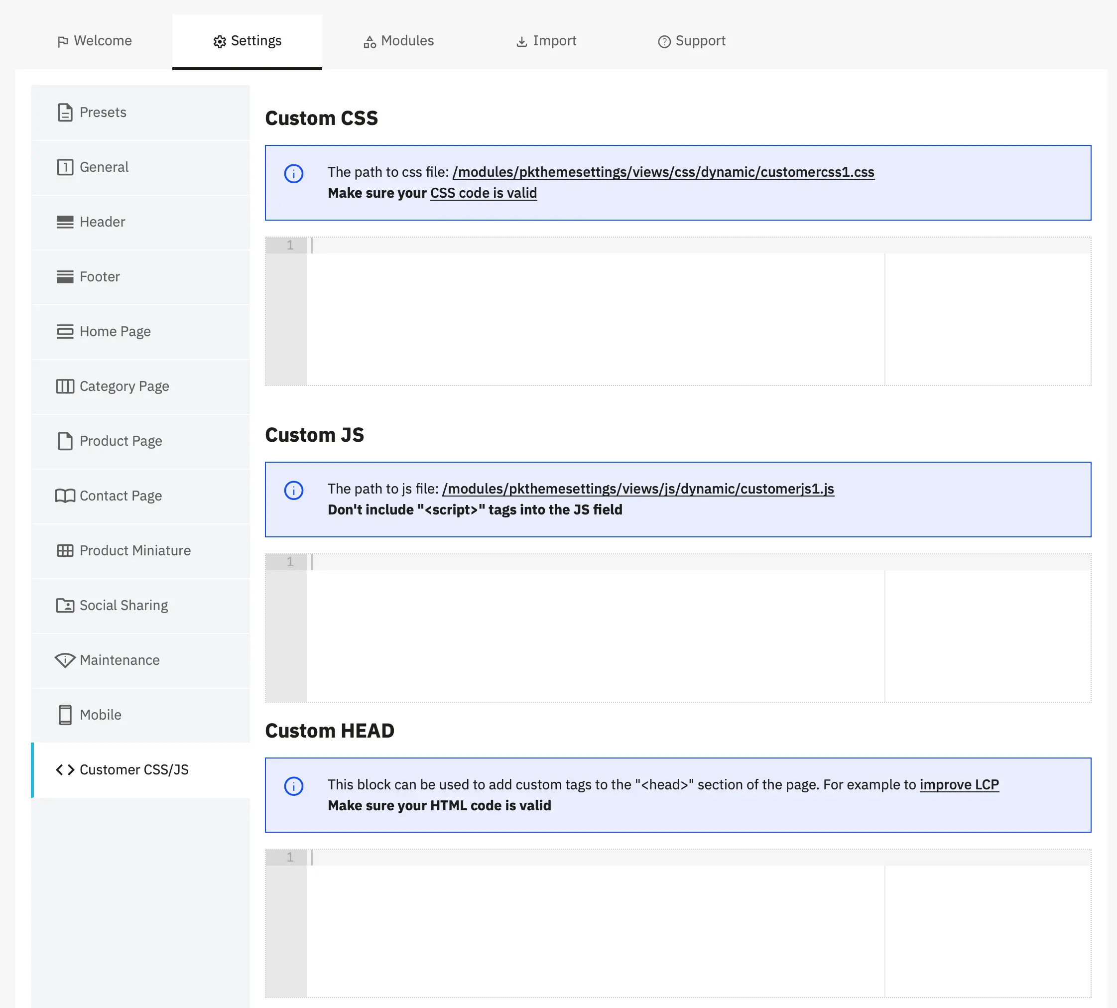
- Custom CSS - Add custom CSS (Cascading Style Sheets) code to modify the appearance and styling of your website.
Why customercss1.css? – 1 is the ID of your store.
- Custom JS - Add custom JavaScript code to add functionality, tracking, or interactive features to your website.
Why customerjs1.css? – 1 is the ID of your store.
- Custom HEAD - Add custom HTML tags to the
<head>section of your website for meta tags, tracking codes, fonts, and more.
<!-- Preconnect to critical domains -->
<link rel="preconnect" href="https://fonts.googleapis.com">
<link rel="preconnect" href="https://www.google-analytics.com">
<!-- Preload hero image for better LCP -->
<link rel="preload" as="image" href="/img.webp" fetchpriority="high">
<!-- DNS prefetch for external resources -->
<link rel="dns-prefetch" href="https://cdn.jsdelivr.net">Hooks used
displayFixedBottomRightdisplayProductAttributesdisplayProductListTopdisplayAfterTitleTagdisplayMaintenancedisplayHeaderactionProductAddactionProductDeleteactionProductUpdateactionPromokitCacheClearactionThemeSettingsUpdateactionFrontControllerSetVariables